

Market Situation Report: The Liquidity Endgame (Global Access)
Dixie’s Coiled Spring, Gold’s 1980 Echo, and the Chip Bubble’s Final Hurrah

Executive Summary
What if the most dangerous signal in markets right now is not the one everyone is watching? While retail traders pile into leveraged semiconductor ETFs and CNBC celebrates fresh all-time highs in NASDAQ, something far more consequential is unfolding quietly in the background. The Dollar Index has been compressing in a monstrous monthly-timeframe range since July 2025, and almost a year of sideways price action is no longer behaving like distribution. It is starting to look like accumulation. At the same time, the US 10-year yield is winding up inside a pattern that has been forming since August 2023, a 2.5-year coil that is now primed to resolve higher. And the catalyst? It is sitting at the gas pump. The oil shock that pushed crude near $100 a barrel for months has already seeped into CPI, which printed 3.8% last week, up from 3.3% in March and the bond market is doing exactly what it is supposed to do: pricing in a future where rates stay structurally elevated.
So why is this not crashing equities today? Because we are not there yet. The real economy will not feel the bite of higher 10-year yields until the lag works its way through mortgages, credit cards, and consumer loans, and that pain shows up roughly three-six months after the borrowing decision. Translation: the bill arrives in September, October, November, not now. Until then, the AI infrastructure buildout narrative is operating in its own regime, completely insulated from the bond market repricing happening underneath it.
But there is a tell. Gold, which has been the single most reliable proxy for global liquidity expansion since September 2022, is showing structural fatigue. The double-inside three-week candle pattern in play is a setup with elite resolution statistics, yet the broader chart is starting to rhyme uncomfortably with 1980. If that parallel holds, the countertrend rally we are about to trade is the last great long opportunity in gold before a multi-year bear market, and the implications for equities, when gold finally rolls over for good, are profound.
Meanwhile, the chip sector bubble is not done. Not even close. Nvidia, AVGO, and the NASDAQ are moving in a tight three-handed dance, and one of those three has not yet caught up. Earnings season is the orchestrated catalyst that completes the choreography, and the seasonality data for one specific name in this trio is so lopsided it borders on absurd. That is the trade we are building toward, and it sits in the climax section of this letter.

Here is what is on the table this week:
Dixie’s monthly coil, almost a year of sideways action since July 2025, is sliding from a distribution read toward an accumulation read with major implications for late-2026.
The US 10-year yield has been compressing for 2.5 years and is primed to break out, with oil at $100 and CPI at 3.8% supplying the catalyst.
Gold is mirroring the 1980 topping sequence with unsettling fidelity, but the immediate setup still points to a countertrend rally targeting the $5,100 to $5,200 zone.
Bond yields rising do not threaten equities yet, but they are quietly building the conditions for a recession roughly six months out.
Nvidia, AVGO, and NASDAQ are running a relay race into earnings, and the laggard in the trio offers the cleanest risk-reward in the entire market.
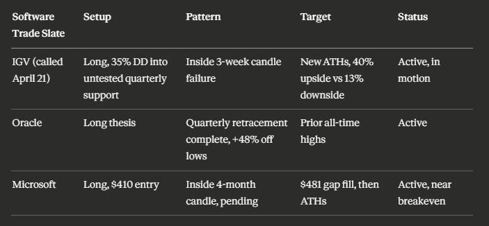
Software has been left for dead by investors who do not actually use software, creating generational entries in Oracle, Microsoft, and IGV.
Retail mania in 3x leveraged chip ETFs is screaming late-cycle, but the music has not stopped yet.
And buried in the seasonality data for one specific chip name is a setup with a 3.82 reward-to-risk ratio and a positive directional bias going back to 2010.
Read on. The climax is real, the data is hard, and the timing window is what we need to figure out
The Dollar’s Silent Bottom and the Yield Curve’s Coiled Spring
A Monthly Range That Refuses to Break
The most overlooked chart in macro right now is the one nobody is excited about. DXY has been grinding sideways since July 2025, almost twelve full months of compression at the bottom of its monthly range. The longer this consolidation persists without resolving downward, the more it begins to flip its character. Distribution patterns do not sit at the lows for a year. Accumulation patterns do. And that is precisely what makes this so important: it is not screaming for attention, which is exactly why it deserves it.
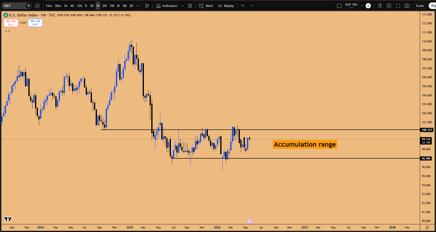
Figure 1: Monthly accumulation range in DXY for past 1.5 years
Is the Dollar about to rip higher tomorrow? Probably not. But the seeds for a proper expansion are being sown right now, and the reverberations will land squarely on every risk asset four to five months down the road. The bond market’s reaction last week, with DXY rallying off the May 12 monthly insult low as US 10-year yields moved higher, is the kind of macro tell that gets dismissed by traders focused only on intraday charts. It should not be dismissed. The DXY rally and the yield rally are moving in tandem because they are pricing the same underlying reality: rates are going higher, and the global capital flows are responding.
The longer Dixie refuses to break down, the higher the probability that what looks like a tired range is actually a bottoming formation in disguise.
The 10-Year Yield Pattern That Started in August 2023
Layered on top of the Dollar story is something even more powerful. The US 10-year yield has been carving out a multi-year compression pattern that began in August 2023 and has now run nearly 2.5 years. Last week’s spike higher was not an isolated event. British yields and Japanese yields moved in tandem, and the global synchronization is the giveaway. This is not noise. This is the early breath of a regime shift.
The catalyst is hiding in plain sight: the oil shock. Crude has been elevated near $100 a barrel for months, and that pressure has finally percolated into the inflation data. Last week’s CPI print of 3.8% is the bond market’s permission slip to reprice everything beyond the front end of the curve.
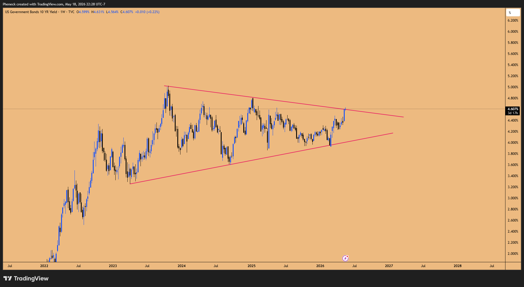
Figure 2: Massive Bull Consolidation happening in US10Y yields for 2.5 years
Why This Does Not Matter Today, but Will in Six Months
Here is the nuance that separates real traders from headline readers. Higher 10-year yields do not crash the consumer overnight. The transmission mechanism runs through mortgages, credit cards, auto loans, and refinancing decisions, and the squeeze typically lands about three months after the borrowing event. That puts the consumer pain window squarely in September, October, November of this year, with a potential recession roughly six months out.
We are still sitting at the same yield levels we saw in September 2023. A one-week spike does not flip the equity regime by itself. The AI infrastructure buildout is in its own bubble world, immune in the short term to what bonds are doing. But the longer-duration consequences are real, and they are building.
Gold’s 1980 Echo and the Countertrend Rally Setup
The Double-Inside Three-Week Candle Pattern
Gold has been in a downtrend since topping on January 28, 2026 at roughly $5,600, and the last four to five months have been a controlled decline. But sitting inside that downtrend is one of the highest-quality structural patterns in the entire gold playbook: the double-inside three-week candle formation.
The historical resolution profile on this pattern is striking. Roughly 80 to 90% of the time, when this pattern takes out the lows of the inside three-week candle, it rejects the sweep and reverses higher to target the upside liquidity. About 61% of the time, the pattern resolves to the upside by the ninth week, delivering an average return of 4 to 5%. And in the rare cases where the pattern breaks out without ever sweeping the lows, the resulting expansion has run 9 to 10% or more.
Figure 3: Double Inside 3-week Candle Failure pattern in play for Gold
Gold almost never just keeps falling after printing this pattern. The cases where it does are vanishingly rare, and the cases where it sweeps the low and rips higher are the rule, not the exception.
The previous cycle showed this beautifully. The 2015 double-inside three-week pattern marked the absolute bottom of a multi-year downtrend, kicking off a vertical rally. The structure that preceded it included a double, then a triple, then another double inside formation, classic extreme compression that resolves into massive expansion.
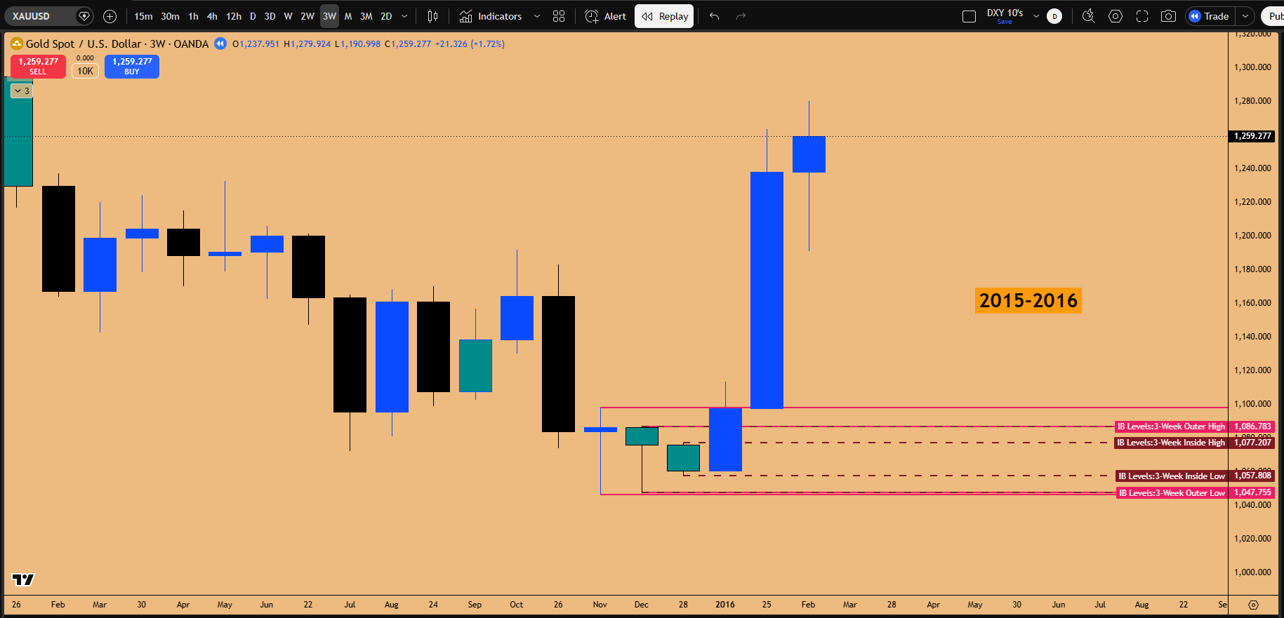
Figure 4: Double Inside 3-week Candle Pattern’s breakouts are very explosive
The Liquidity Pipeline: Gold, Equities, and the Speculative Final Wave
Why Gold Dictates Equities
Pull up a side-by-side of gold and the S&P 500 since September 2022, and the choreography is unmistakable. Gold and equities have been moving as joint functions of the same expanding liquidity. When the Fed drained liquidity, gold drained alongside equities. When the Fed pivoted, gold ripped to all-time highs before equities finished their leg up, effectively programming the algorithm to chase.
Then came the divergence. The January 29, 2026 equity top coincided exactly with the gold top. Gold has not made a new all-time high since. Equities, by contrast, have ripped vertically off the recent bottom. That divergence is the tell. The liquidity flowing into equities right now is no longer the broad global liquidity that gold tracks. It is speculative, narrow, and concentrated in the chip bubble.
Retail Mania and the 3x Leveraged ETF Tell
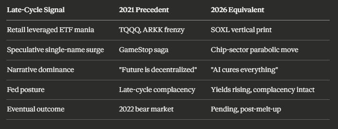
The structural shape of this rally is screaming late-cycle. The weekly chart of SOXL, the 3x leveraged semiconductor ETF, is showing exactly the kind of vertical print that retail manias produce. Institutions do not buy 3x leveraged ETFs. Retail does. And we have seen this movie before, in 2021, during the GameStop saga, just before the inflation-driven Fed pivot ended the party.
The melt-up keeps melting up right until the Fed walks in with the pepper spray. The party is real, but the door is not far away.
The Triage: Where the Bubble Actually Lives
The bubble is not in NASDAQ broadly. It is in the chip sector, specifically SMH, Nvidia, AVGO, and the broader semiconductor complex. If you are not positioned in the chip names while the bubble runs, you are missing the gains entirely. But this also means risk management is paramount: this is a melt-up, not a regime change, and melt-ups are the transition points immediately preceding major tops.
The Three-Handed Dance: Nvidia, AVGO, and NASDAQ
The Magnet Mechanism
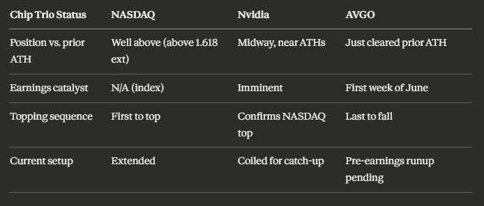
Three names have been moving the entire equity index in lockstep, and understanding their relative positioning is the difference between catching the move and chasing it. NASDAQ is trading well above its prior all-time highs, sitting above the 1.618 fib extension. Nvidia is midway, still climbing toward its own 1.618 extension at $241.80. AVGO has barely cleared its previous all-time high. The trio is correlated, and the laggards always catch up before the leader tops.
The bottom that printed across all three on the recent correction was simultaneous. The top that will eventually print will also be simultaneous, and the sequence of who tops first matters enormously. NASDAQ will top first, confirmed by Nvidia topping, with AVGO being the last to fall. We have seen this pattern before. The October top in AVGO preceded a NASDAQ bottom; the recovery sequence ran AVGO making new highs first, then NASDAQ catching up, with Nvidia lagging until much later.
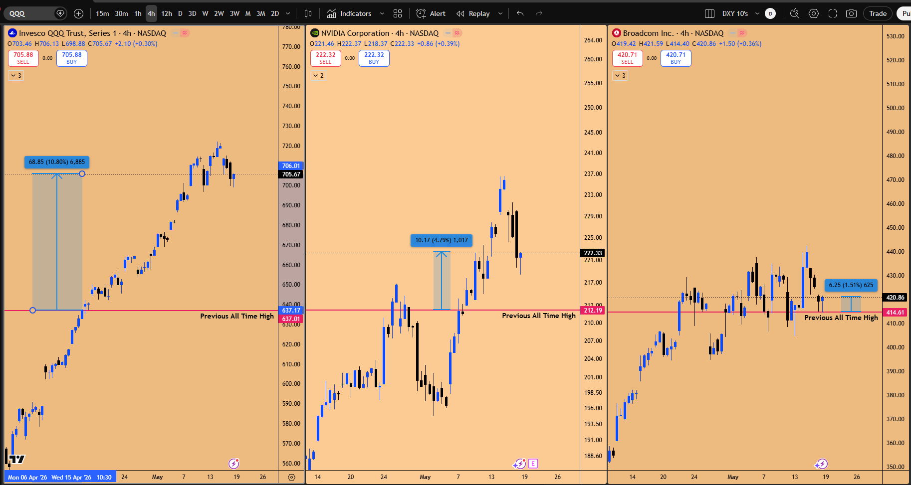
Figure 5: QQQ vs NVDA vs AVGO, The trifecta on whose shoulders the entire US stock market depends
Earnings as Orchestrated Catalyst
Here is the punchline on timing. These mega-cap chip names do not run randomly. They run into earnings, by design. The market needs a justifiable headline so the algorithms can frame a 5 to 10% move as “earnings-driven.” AMD’s blowout report already telegraphed what Nvidia and AVGO are about to deliver. The market already knows. It is just waiting for the calendar.
The earnings number is not the catalyst. It is the alibi. The positioning happens weeks before, and the news cycle catches up after the fact.
Nvidia’s earnings event is imminent. The option calls already opened at the $230 to $235 strike are positioned to capture the runup to the $241.80 target.
The Software Trade, Three Weeks Later
The April 21st Call, Now Playing Out
Three weeks ago, in the April 21st, 2026 Market Situation Report titled The Rally for History Books, the climax setup of the entire thesis was IGV, the software sector ETF. At the time, IGV had drawn down 35% from all-time highs, a recessionary-level drawdown without a recession, into a quarterly support zone that had never been tested before. The trigger was an inside three-week candle failure. The framing was deliberately stark: a 3-to-1 swing risk-reward, roughly 40% upside against 13% downside, in a sector the consensus had written off as obsolete because of AI.
That was the contrarian call. The crowd was fearful that AI would gut hyperscaler software revenue. The structural setup said the opposite: buy the asymmetric drawdown into untested support with a defined trigger and a defined invalidation. Generational entries look like this in real time, not in hindsight.
The crowd was fearful of software when IGV was sitting at a 35% drawdown into untested quarterly support. That fear was the entry. The structural trigger had already fired.
Three weeks later, the trade is doing what the structure forecasted. IGV has rallied off the inside three-week candle failure, the broader software complex is firming up, and the AI-replaces-software narrative is dissolving on contact with reality. This is not a new thesis. It is a continuation of the April 21st position.
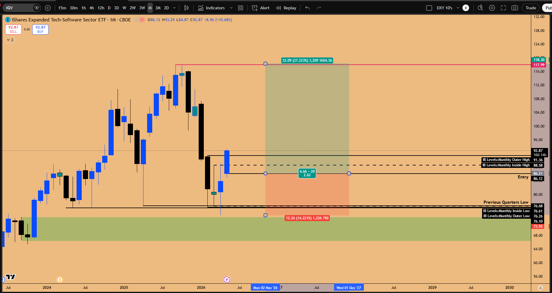
Figure 6: Software Sector is bottomed, Swing trade in full bloom, All Time High’s remains the target
Why the AI-Replaces-Software Narrative Was Always Wrong
The lived experience of building real production AI workflows reveals why software developers are about to become more valuable, not less. AI breaks, hallucinates, and lies about completing tasks. Setting up a working hive-mind brain protocol, the infrastructure required to make AI genuinely useful inside a business, takes 3.5 months of full-time work. The guardrails required to make AI functional in production require deep software engineering expertise, and every company on Earth is about to need that expertise to deploy AI internally.
The investors pricing software as obsolete are the investors who do not use software. The demand for skilled software engineers is about to go vertical, not vanish.
Oracle: The 60% Discount Generational Setup
Oracle offered the cleanest single-stock expression of this thesis. The selloff over debt concerns drove the name down roughly 60% from highs, and the market is now waking up to the reality that battle-tested legacy software, debugged across decades, is irreplaceable. Oracle has retraced its prior quarterly downturn within one to two months and runs 48% off the lows. The path back to all-time highs is the base case over a three- to six-month window. The legacy engineering depth, dating back to the 1990s, is exactly the kind of stress-tested infrastructure AI cannot replicate.
Microsoft: The Inside Four-Month Pattern and the Untapped High
Microsoft sits inside a four-month inside-monthly pattern that has not yet confirmed as a failure, but the structural read points to a rally targeting the $481 gap fill in the short term and new all-time highs in the next four to eight months. The previous spike to all-time highs in August or September never took out the actual prior high in regular trading hours; it traded above only in after-market, leaving that equal high as untapped liquidity the market is magnetized to revisit.
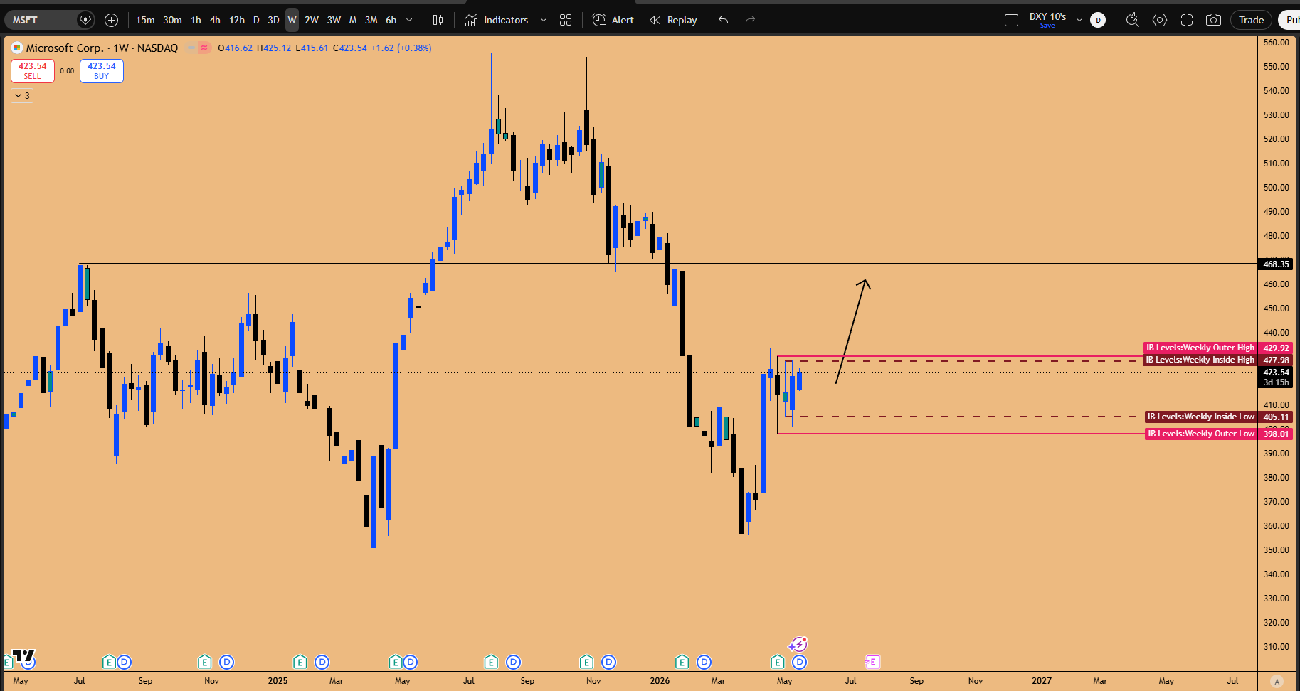
Figure 7: MSFT triggering long with Inside weekly candle failure pattern being confirmed last week.
The long position opened at $410 sits near breakeven. The thesis: Microsoft is the Switzerland of AI compute, providing infrastructure to OpenAI, Anthropic, Perplexity, and Grok simultaneously. As AI compute demand accelerates, Microsoft accelerates with it. Whatever catalyst the headlines pin on the move, Bill Ackman opening a position, Bill Gates closing one, is incidental; the structural positioning was in place weeks before the news cycle caught up.
The Climax: AVGO and the Seasonality Trade of the Year
This is what the entire letter has been building toward. AVGO is sitting at a confluence so dense, with seasonality data so lopsided, and a risk-reward profile so favorable, that calling it the highest-conviction setup of the week is not hyperbole. It is arithmetic.
The Inside Two-Day Candle at Previous All-Time Highs
The trigger is an inside two-day candle pattern that formed precisely at AVGO’s previous all-time highs. The pattern resolved upward, confirming a bullish-order-block failure scenario on top of resistance. This is the classic structural setup where prior resistance becomes support and the market refuses to revisit the low of the trigger candle.
The trade was entered around $409 to $415, with the stop placed below the $394 low of the previous 3-week candle. The target is the yearly R1 pivot at $461.27. The risk-reward on this single setup is 2.3 to 1.
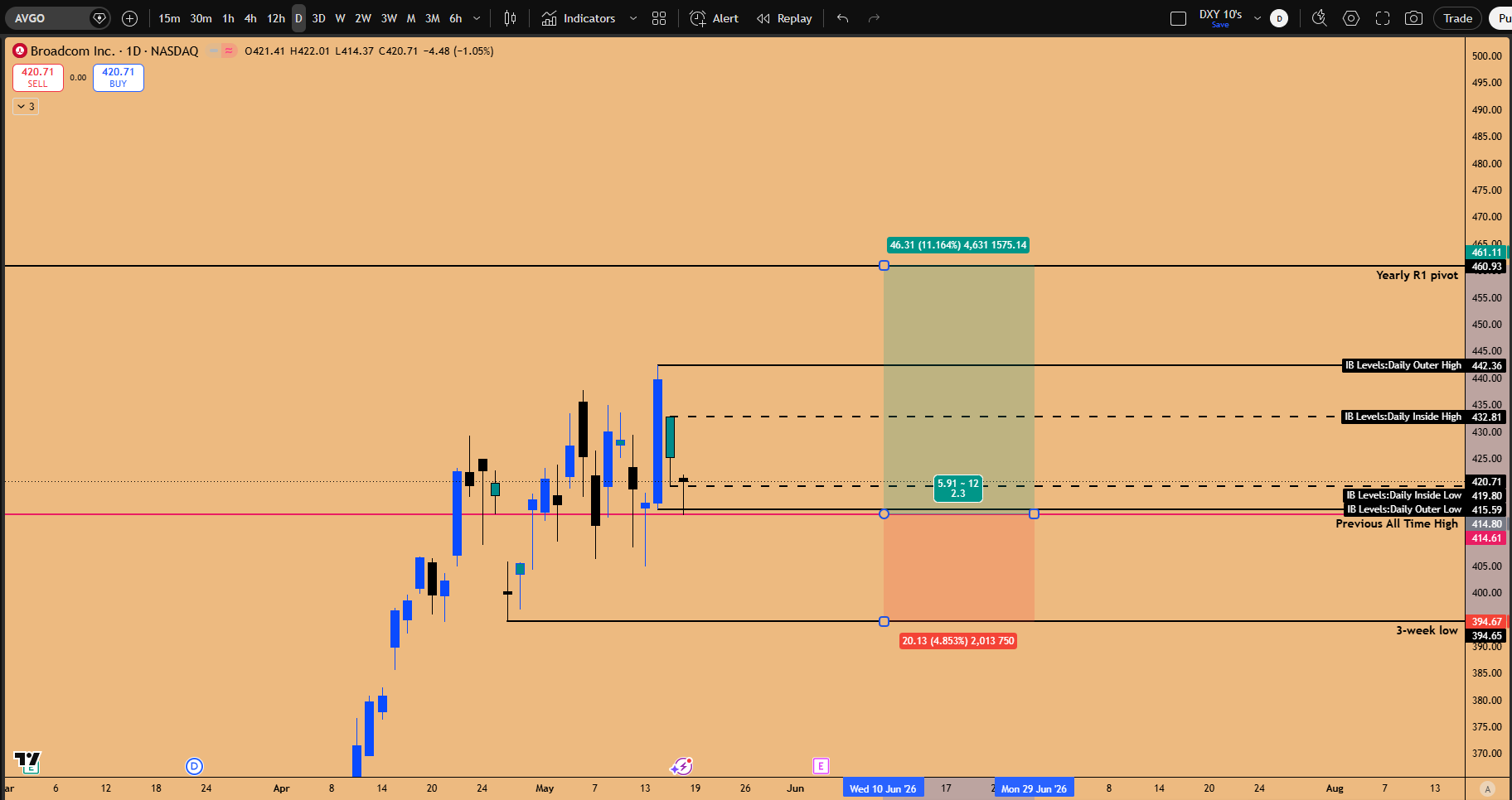
Figure 8: Long Setup in Play for AVGO ahead of earnings
The Seasonality Data That Sealed the Conviction
Here is where the AI-assisted research changed the conviction profile entirely. Pulling daily, weekly, two-week, three-week, and monthly candle data for AVGO back to its 2009 IPO and analyzing the month of May reveals an extraordinary pattern: May has only printed negative for AVGO twice since its IPO. The seasonality is not just bullish, it is dominant.
Breaking the data down further, the second half of May, specifically the third weekly candle and the fourth weekly candle leading into AVGO’s early-June earnings event, captures a median two-week range of roughly 11 to 13%. The net signed return across 2010 to 2025 runs positive 14 out of 16 years. The third weekly candle averages +1.5% with a 10-up, 6-down split. The fourth weekly candle averages +3.78% with a 12-up, 4-down split.
The mean net return for the second half of May going into AVGO’s June earnings is roughly 5%, with the median sitting at 5% and the upper end pushing 7.61%. Sixteen years of data, and the directional bias is mechanical.
The structural and seasonal layers stack perfectly. Historical examples reinforce this: in 2023, AVGO ripped 47% in 18 days going into earnings; in 2024, the second-half May runup into June was textbook; in the 2022 bear market, even with the broader index falling, AVGO still rendered a positive second-half-of-May return into earnings. The earnings number gets pre-priced because AMD and Nvidia report first and reveal the GPU and revenue acceleration that telegraphs AVGO’s print.
The Trade Card

Once AVGO tags the yearly R1 pivot at $461, all bets are off. The yearly R1 is the obvious algorithmic magnet, and the prior bottom printed on the yearly pivot itself, confirming the level’s gravity. After that target prints, the position closes. No greed. No “let it ride.” The data ends at R1, and so does the trade.
Still with us? Then you are exactly who this letter is built for. Subscribe to Speculators Edge to get the full weekly market map, software-sector trade frameworks, timing windows, and follow-up analysis delivered directly to your inbox. New readers can use the reader-only offer below to join at a discounted rate. For our regular readers, we have initiated a 50% discount code for the first month of your subscription. We truly appreciate your support.
Key Takeaways
1. High-Conviction Trade Setup: Broadcom (AVGO) Long
The confluence of technical structure, multi-year seasonality, and industry catalysts makes AVGO the premier setup in equities.
Technical Structure: Inside two-day candle pattern at previous all-time highs confirmed as a bullish order block.
Trade Parameters:
Entry Zone: $409 – $415
Stop Loss: Below $394
Target Price: $461.27 (Yearly R1 pivot)
Reward-to-Risk Ratio: 2.3
Seasonality (16-Year Data): Second half of May is positive 14 of 16 years (mean/median return ~5%, upper end 7.61%). The 4th weekly candle alone averages +3.78% (up 12 of 16 years).
Catalyst: June earnings pre-priced via AMD’s blowout report and Nvidia’s imminent print, signaling sector acceleration.
2. Sector Mechanics & The AI Capex Boom
The Relay Sequence: The NASDAQ, Nvidia, and AVGO trio is mid-relay. AVGO is the laggard sitting closest to its prior all-time high with the most remaining upside.
Market Cycle: Late-cycle retail mania is evident in SOXL. However, accelerating GPU/TPU demand from mega-caps (GOOGL, AMZN, TSLA, META, MSFT, ORCL) keeps the near-term momentum intact.
Software Turnaround: Contrarian, structural entry points are emerging in Oracle, Microsoft, and the IGV ETF, driven by an imminent acceleration in software developer demand for production AI workflows.
Macro & Market Outlook
1. Divergent Macro Risks
While equities melt upward, underlying macro indicators point to structural instability:
Currency & Yields: The Dollar Index (DXY) is shifting from distribution to accumulation after compressing sideways since July 2025. The US 10-Year yield is coiled to break higher.
Inflation Pressures: Oil approaching $100 and CPI at 3.8% are fueling higher yields, positioning a consumer pain window for Sept–Nov 2026, with recession risks building six months out.
2. Commodities (Gold)
Near-Term: Set up for an immediate countertrend rally targeting the $5,100 – $5,158 zone.
Long-Term: Mirroring the 1980 topping sequence structure, implying a multi-year bear market ahead that will ultimately drag equities down.
What’s your positioning on these setups? Let’s discuss in the comments below. Subscribe for weekly structural breakdowns and share this with fellow traders if you found it valuable.
> Disclaimer: This analysis is for educational purposes only and does not constitute financial advice. Always conduct your own risk management and research.